The Challenge
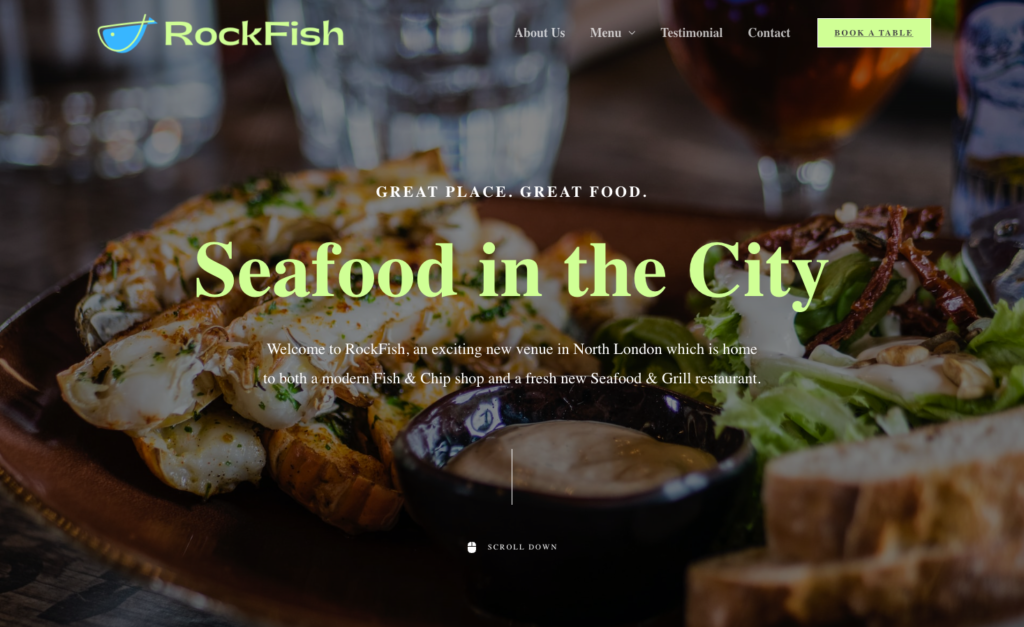
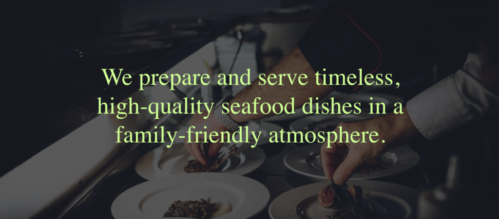
RockFish, a new Seafood restaurant in north London needed a website that could entice its customers and standout in a competitive market. With a proven track record in Restaurant Web Design, we knew the team at Pathmaker were best placed to succeed.
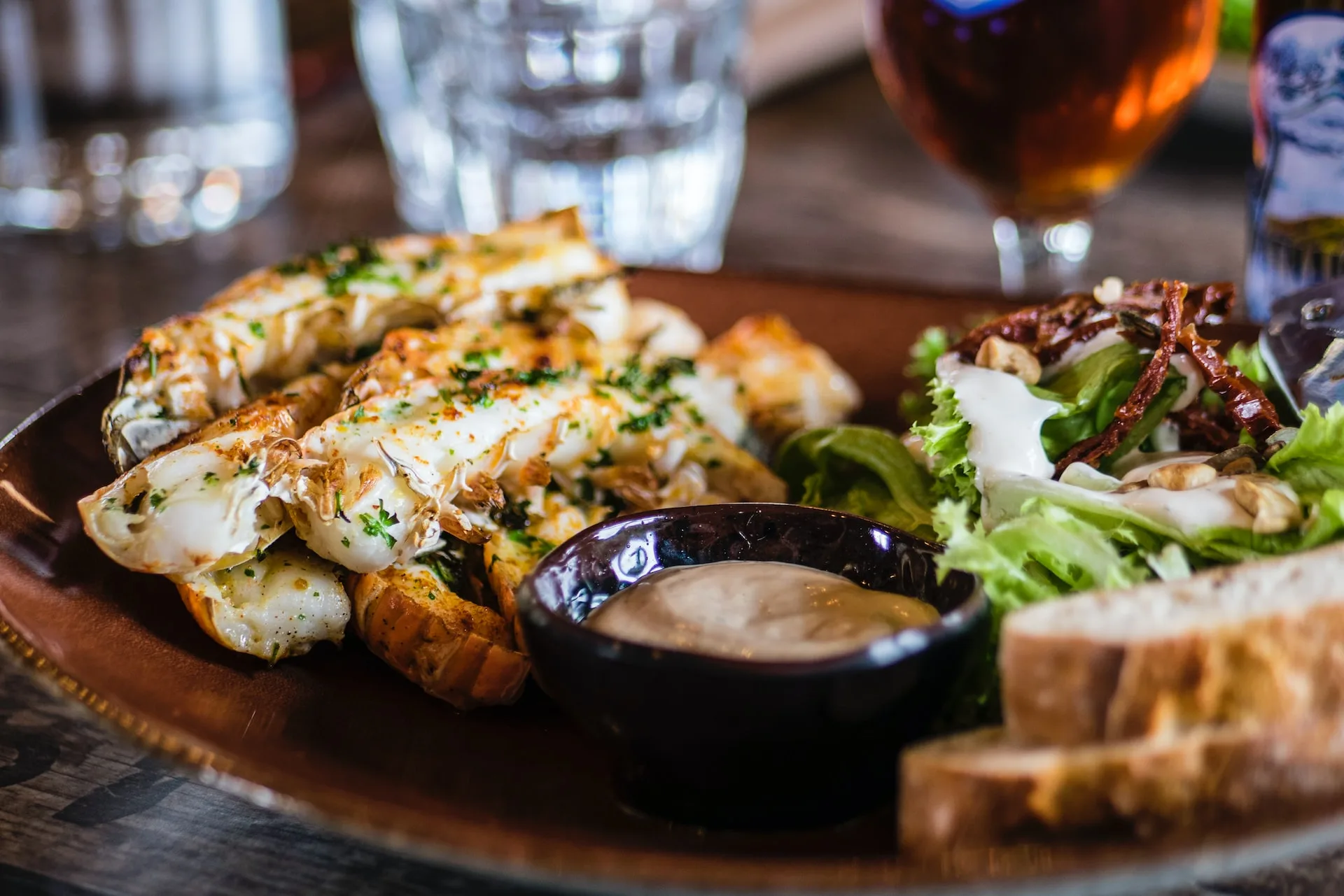
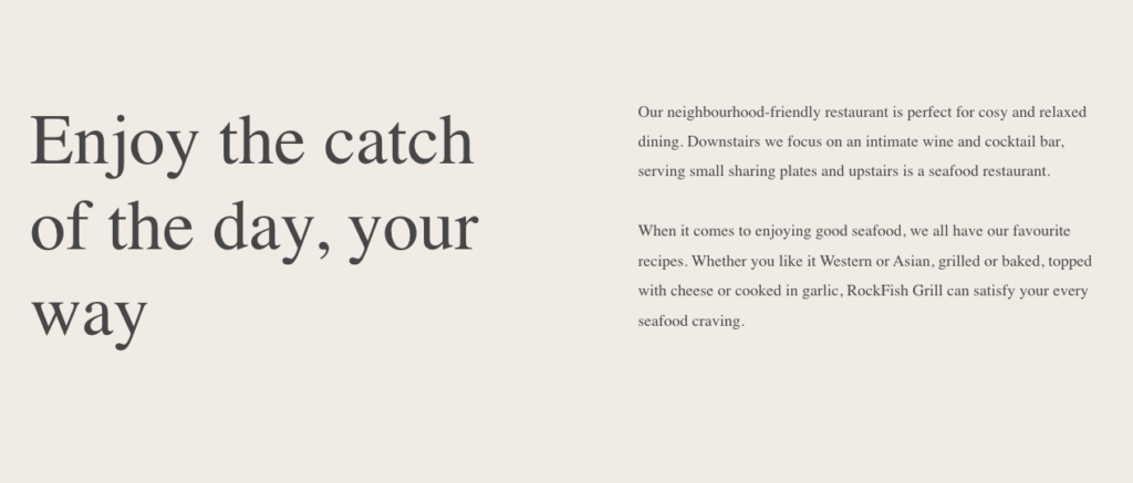
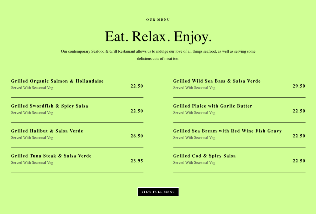
RockFish wanted to be able to share a bit about what they do, while also displaying their menu in an easy to read format. Their goal was to have a website that could be updated easily for menu changes. Whilst also able to be viewed by people on the go who were looking for a great restaurant option in the neighbourhood. They also needed reliable and secure hosting for their website.
As a brand, RockFish was lacking visual consistency across all its channels. As a new venue, it also needed to differentiate itself from peers and competitors in the restaurant space. Especially as its offering expands into Fine Dining, whilst also providing a Fish & Chip Shop and takeaway.
The Brief
RockFish needed an invigorating rebrand that would connect with younger, diverse, and more socially-engaged audiences. Whilst retaining their sincere, informal tone of visual voice. As innovative leaders in their space, the organisation wanted a brand that represented their ideals of boundary-pushing and a brighter and more diverse future.
Alongside this, a new website was required that was easy to navigate and would generate new customers, restaurant bookings, and take-away orders. Whilst maintaining focus on RockFish’s social impact, climate awareness, sustainable mission and values.
The Process
From a brand perspective, the logo has been recreated from scratch. Developing a number of executions through creative ideas in the form of mood boards, to capture the values and mission of the organisation. Combining a unique and contemporary font with people-centred imagery and a bright contrasting palette creates a distinctly fresh and modern brand.
A comprehensive discovery report and a brand audit revealed that many customers weren’t exploring the site further than its homepage. An intuitive sitemap has been developed and homepage content created that suits website users and the goals of the organisation, whilst building an online community for those with shared interests.
The Solution
The result is a strong, playful wordmark and logo that is uniquely identifiable, while still flexible enough to adapt to many variable applications and sub-brands. The distinctive font and refreshing colour palette lead the rebrand. Community kept at the heart and centre of RockFish’s values.
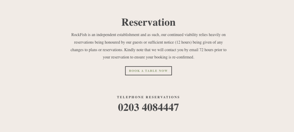
They can expand their site to include additional pages, or even a recipe blog. All while still keeping most of their time focused on creating a great dining experience. The site allows RockFish to attract diners who are using their smartphones, due to fully responsive web design. Customers can get directions, check out the menu, and call for a table reservation easily.
A brand new clear grid system and modular site layout also help users navigate quickly. Irrespective of if they are looking for a quick bite to eat or a sit down dining experience.
gyygyugu ,mkhbjb
jkbkjbkbkb